How to Make a Website Header That Captivates & Converts
A step-by-step guide to designing website headers that captivate and convert — covering essential components, design principles, navigation, responsiveness, SEO, and common mistakes.
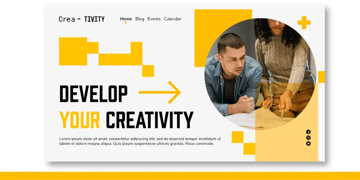
Introduction: The Gateway to Your Website
Consider this analogy: entering a store with a messy, disorganized entrance would likely discourage browsing. Your website header functions similarly as a digital entry point. It represents the first impression visitors encounter and significantly impacts whether they remain engaged and eventually complete desired actions. A well-crafted header establishes brand identity, facilitates navigation, and directs user behavior — ultimately determining the success or failure of the overall user experience.
This guide addresses small business owners, development beginners, and content creators seeking to develop intuitive, engaging, and mobile-friendly headers without excessive technical terminology. Whether building from scratch or refining existing designs, professional resources can help transform your vision into reality.
What Makes a Website Header Work?
High-performing headers balance aesthetic appeal with practical functionality. Essential components include:
- Logo/Branding: Present a crisp, clickable logo linked to your homepage
- Navigation Menu: Prioritize essential pages only to minimize decision fatigue
- Call-to-Action (CTA): Make your primary action bold and prominent, whether requesting quotes, demos, or trial signups
- Search Functionality: Particularly valuable for content-dense or e-commerce platforms
- Utility Links: Include login options, shopping carts, language selectors, or contact information as appropriate
A thoughtfully structured header enhances user journeys and encourages meaningful interactions.
Design Principles That Drive Impact
Effective header design follows these core principles:
- Visual Hierarchy: Guide attention naturally from logo through navigation to CTA
- White Space: Provide breathing room between elements; clutter diminishes conversions
- Color Psychology: Leverage brand colors strategically and maintain high contrast for readability
- Typography: Limit yourself to two fonts maximum; use size and weight to signal importance
- Consistency: Maintain uniform headers across all pages to establish trust
Understanding what motivates user action should shape your layout decisions.
Navigation That Feels Effortless
Support smooth, intuitive browsing through:
- Sticky vs. Static Headers: Sticky headers maintain navigation visibility during scrolling, though mobile versions should remain compact
- Label Clarity: Use straightforward terminology like “Services,” “Pricing,” or “Contact” rather than creative alternatives
- Current Page Highlighting: Indicate visitor location within site structure — a simple yet effective usability enhancement
The objective involves creating navigation that users can operate instinctively without conscious effort.
Why Responsive Header Design Matters
Mobile traffic frequently equals or exceeds desktop visits, making responsive design essential. Implement these strategies:
- Mobile Navigation: Employ hamburger menus or off-canvas navigation to maintain clean layouts
- Touch Targets: Ensure buttons and links remain easily tappable
- Breakpoint Adjustments: Guarantee graceful header adaptation at 768px, 1024px, and other standard breakpoints
A mobile-optimized header on a website isn’t optional — it’s expected.
The SEO Side of Your Header
Headers subtly influence search engine optimization through several mechanisms:
- Logo Alt Text: Describe logo images with descriptive alt text supporting both accessibility and image SEO
- Navigation Anchor Text: Keyword-rich, descriptive link text aids search engines’ comprehension of site structure
- Core Web Vitals: Heavy headers can negatively impact Largest Contentful Paint (LCP) or Cumulative Layout Shift (CLS); maintain layout stability and optimize asset loading
Effective headers simultaneously serve user goals and search algorithm requirements.
Header Design Mistakes to Avoid
Common failures include:
- Overcrowding with excessive menu items
- Absent or weak CTAs
- Poor color contrast reducing readability
- Non-responsive layouts
- Unoptimized images slowing load times
- Inconsistent design across pages
- Accessibility oversights
These issues frequently prevent headers from converting visitors despite attractive appearances.
A Practical Step-by-Step Workflow
Converting strategic intentions into functional headers follows this approach:
1. Plan with Purpose
- Define objectives: lead generation or brand awareness?
- Research audience expectations upon site arrival
2. Design Intentionally
- Wireframe layouts using Figma, Adobe XD, or comparable tools
- Test multiple navigation flows and structural approaches
3. Implement Smartly
- Select appropriate platforms: Webflow, WordPress, Shopify, Squarespace
- Optimize code and assets for performance
- Consider professional development partners for custom implementations
4. Test Relentlessly
- Verify responsiveness across diverse devices
- Gather user feedback through Hotjar or UserTesting
- Run performance audits via GTmetrix or Google PageSpeed Insights
Developing universally appreciated headers begins with clarity and progresses through iterative refinement.
Must-Have Tools for Designing Headers
- Design: Figma, Canva, Adobe XD
- Stock Assets: Unsplash, Pexels, FlatIcon
- Color Palettes: Coolors, Adobe Color
- Fonts: Google Fonts, Fontjoy
- Page Speed: GTmetrix, PageSpeed Insights
- User Testing: Hotjar, Crazy Egg, UserTesting
These resources elevate headers from amateur-level to professional quality regardless of technical background.
Bonus: Interactive Header Checklist
Before launching, verify:
- Is your CTA clearly visible and prominent?
- Does navigation function properly across all devices?
- Have images and icons been optimized?
- Does the header meet accessibility standards?
- Is the design visually consistent with remaining site sections?
Real Examples: What Works & What Fails
Header Win
Clean navigation, excellent contrast, bold CTA, mobile responsiveness.
Header Fail
Missing CTA, poor color contrast, non-collapsing menu on mobile.
Analyze these scenarios with your team to identify improvements and replicable successes.
Final Thoughts: Make Your Header Count
Website headers function as strategic assets rather than decorative elements. When executed effectively, they enhance brand perception, facilitate navigation, and drive conversions. When neglected, they confuse visitors and encourage departure.
Prioritizing header optimization directly impacts user experience and engagement outcomes.